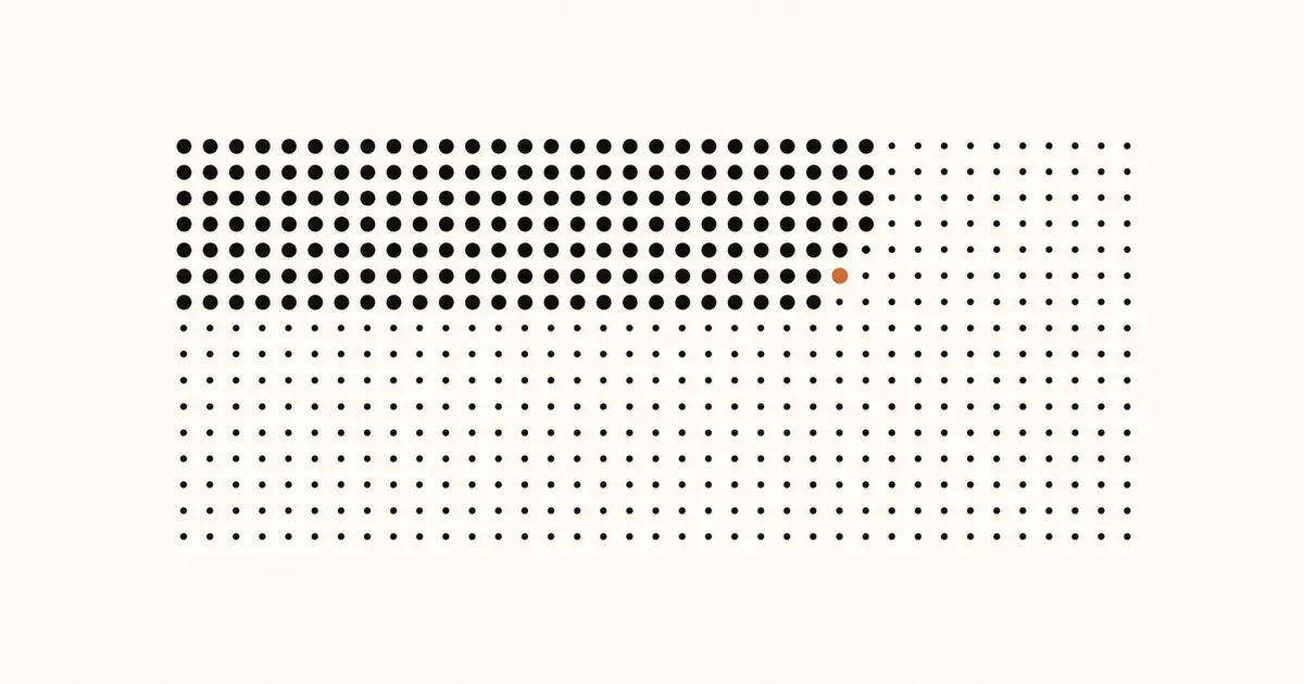
A life in weeks wallpaper turns a long stretch of time into one quiet grid: one dot for each week, rows for years, filled dots for elapsed weeks, and one accent dot for the present. The point is perspective, not prediction. You choose the grid’s end year as a design horizon; the wallpaper does not know or estimate how long anyone will live.
This guide explains the idea, shows how to make a readable lock-screen version, and separates a lifetime view from a 365-day year-progress wallpaper or an event countdown.
Key takeaways
- A life calendar makes a user-chosen span visible as weekly dots; it is not a medical or life-expectancy forecast.
- One row per year and 52 columns per row create a compact, recognizable structure.
- Calm contrast and generous space around the phone clock matter more than extra labels.
- Start with one purpose: long-term reflection, this year’s progress, or a single deadline.
What is a life in weeks wallpaper?
A life in weeks wallpaper is a phone background based on a life calendar: a grid where each cell represents one week. The format became widely known through Tim Urban’s illustrated essay “Your Life in Weeks”, which uses equal-sized boxes to make a long period easier to see at once.
On a lock screen, the grid becomes a passive reference rather than a task list. You do not need to open an app to locate the present week. Filled and unfilled dots show the relationship between the time already represented and the horizon you selected.
The calendar is deliberately simple:
- columns represent weeks;
- rows represent years;
- filled dots represent elapsed weeks;
- one accent dot can mark the current week;
- future dots remain visually lighter.
That structure is different from a conventional calendar. It does not replace appointments, reminders, or health guidance. It only changes the scale at which you view time.
Choose a horizon without turning it into a forecast
The safest way to use a life calendar is to treat its last row as a chosen visualization boundary. Pick a round age that makes the grid useful, then remember that the number is an interface setting—not a personal prognosis.
This distinction matters because no wallpaper can predict a lifespan. Avoid labels such as “weeks left” if they feel too absolute. Alternatives such as “selected horizon,” “weeks shown,” or no statistic at all keep the design honest. You can change the horizon whenever your preference changes.
You also do not have to use a lifetime scale. If the full grid feels heavy or too abstract, switch to the day-counter and countdown approach. A shorter period can answer a practical question without attaching meaning to an entire life.
How to create a life in weeks wallpaper
1. Select the Life view
Open the wallpaper generator and select Life. This view is implemented as a weekly grid with 52 columns and one row for each year in your chosen horizon.
Enter your birth date so the generator can identify elapsed weeks. Then choose the end age used to size the grid. Verify the preview by checking that the present marker sits after the filled weeks and before the unfilled weeks.
2. Decide what the current week should look like
Use one restrained accent color for the present week. Past and future dots should remain distinct even when the accent is removed, so the design still reads in low brightness or grayscale.
A good three-state system is:
- dark or solid for elapsed weeks;
- muted or outlined for weeks beyond the present;
- one accent for the current week.
Do not add a separate color for every decade unless it improves recognition. Decade spacing can organize the grid without turning it into a legend readers must decode.
3. Protect the lock-screen safe areas
Leave generous negative space around the clock, widgets, notifications, and bottom controls. The preview should be tested on the same phone shape you plan to use. A grid that looks balanced on a desktop canvas can feel crowded once iOS crops the image.
Apple’s current iPhone wallpaper guide shows how Lock Screen photos are positioned and customized. After applying the image, check the crop and any depth or blur options rather than assuming the preview and final lock screen will match perfectly.
4. Generate and apply the wallpaper
Generate the image only after the layout is readable at a glance. Save it, set it as the Lock Screen photo, and inspect three things: whether the present dot is visible, whether the clock overlaps the grid, and whether future dots disappear against the background.
If you want the image refreshed automatically, follow the automatic wallpaper setup guide. Apple documents the Automation area in its Shortcuts guide for iPhone. The automation fetches a current image; the wallpaper itself is still a static photo between updates, not an animated Live Photo.
Life calendar, year progress, or countdown?
Choose the scale that matches the question you want the lock screen to answer.
| View | Best question | Typical structure |
|---|---|---|
| Life in weeks | “Where is the present within a long horizon?” | Weekly dots across many yearly rows |
| Year progress | “Where am I in this year?” | 365 or 366 daily dots |
| Countdown | “How long until or since one date?” | A custom start and end date |
A life calendar is broad and reflective. A year grid is easier for seasons and annual plans. A countdown is the clearest choice for a trip, exam, launch, or anniversary. Keeping these intents separate prevents the life-in-weeks page from competing with the site’s countdown guide.
Why seeing life as weeks changes how time feels
Days often pass without showing their relationship to a longer timeline. A weekly grid makes that relationship tangible: previous rows become a visible history, the highlighted dot locates the present, and unfilled rows show a horizon that still has room for choices.
This is the idea behind the original One Dot philosophy. The grid is not meant to create fear or score whether time was used “correctly.” It is a quiet prompt to notice what deserves attention now—work worth pursuing, people worth seeing, or ordinary moments worth being present for.
The most useful response is not urgency for its own sake. It is intention. Choose a horizon that feels constructive, let the grid provide perspective, and change or remove it if that perspective stops helping.
Make the wallpaper calm, not demanding
A useful life calendar should orient you without judging you. A filled dot records time represented by the grid; it does not say whether that week was productive, happy, wasted, or successful.
If the image creates pressure, simplify it. Hide percentages, remove “remaining” language, soften contrast, or choose a shorter period. You can also keep the life view inside the generator and use a less emotionally loaded wallpaper day to day. The design works only when it serves your attention.
For more ways to visualize time without mixing intents, browse the One Dot blog and compare the life view with year progress and custom date ranges.
Create your weekly life calendar
Turn the weekly grid into your lock screen: download One Dot on the App Store.